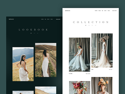
MYWONY Website: Lookbook and Collection Pages
One more shot is ready to share the atmosphere of tender elegance of wedding outfits: it continues showing you one of our recent projects, web design and development for MYWONY, a company dressing up the beautiful brides around the world.
This time we offer you to check the contrast of lookbook and collection pages. They are all about the best presentation of the dresses: that is the reason bringing the visitors to the website and nothing should distract them from what they are looking for. So, the visuals play the premier violin here and the interface is done as an efficient background helping the users to navigate intuitively and enjoy the photos. The pages use different background colors: the lookbook is presented on the deep and luxurious dark background while the collections are shown on light and airy background. For the easy navigation, the page uses a sticky header that is clear but unobtrusive so it doesn't distract visitors from the visual content.
Also, you are welcome to check the brand intro, an original space adventure cartoon or get more details on the design process and iterations for it in the design case study. Catch the romantic vibe!

