Mobile Checkout
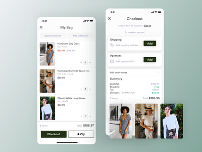
New checkout experience for Tapcart apps in which I implemented a "one-page checkout" to increase conversions instead of a "3-step checkout" with breadcrumbs.
Putting everything on one single screen in this new design allows for higher conversion as the user has it all in front of them from the get-go, knowing what to expect. They just need to add "Shipping" and "Payment". In comparison to our old design which had breadcrumbs at the top of the screen letting them know that they had 3 big steps to complete. As a user saw that, they knew there was work to be done on their end, leading to drop off rates.
It also allowed us to add more functionality that customers were requesting (adding notes, billing address, phone number requirement).
To see the full checkout experience in action download any one of our apps: Fashion Nova, The Hundreds, Chubbies, Planet Blue, Stone Cold Fox – to name a few.
Cheers,
Alex 🇫🇷
