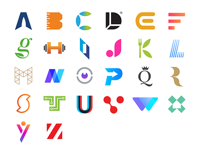
26 Logos Alphabet Dribbble
So there we have it, all 26 logos from the the “Alphabet Logo” series. What are your favourite 3?
What is "Alphabet Logos"?
A mini project of mine highlighting some logos that I've designed over the past 10 years, each one representing a letter from the alphabet.
Why?
I wanted to focus on the purity of letterforms without any accompanying text to communicate that logos don't need to be overdrawn or literally say what a business does (eg. a car logo does not have a car in its logo). A logo is simply there to identify.
And when it comes to identification and memorability, simplicity JUST works. Think about the most memorable logos, they're damn simple... Nike's tick, Target's target, McDonald's M, etc.
Successful logos should stand the test of time, work at all scales, be distinct, versatile, and work in both color and B&W.
Need a logo / branding?
Message me or visit Justcreative.com
