Protos Mobile Prototyping from Collective Ray
Hey Guys!
So, not only have we been working on some really cool client projects at Collective Ray, but we've been cooking up some stuff of our own!
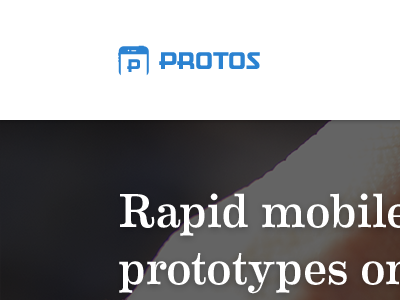
@Jeff Broderick has been building the backend for Protos, I've been working on this marketing page. So far I've come up with a mark and layout for the initial sign-up screen. I know it's not much—under the circumstances, I've gotta keep this a bit secret for now—but what do you guys think?
I'll post more as I can. I'm using Motel Gothic for the mark and Eames for the headings.
Trying to switch it up from my normal style and start giving more attention to things I haven't given as much attention to in the past. I'm not worrying as much about layer styles, but more on solid typography, layout, and color pallets. It's a pretty new approach for me, but what're your thoughts on my execution (that you can see from this tiny shot, lol)?
