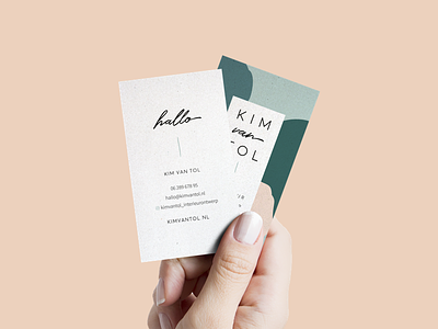
Kim van Tol Interior Design: Business Card
For the business card I went with an unconventional lay-out: portrait instead of landscape. Really like how this worked out!
Also something worth sharing, a really kind testimonial by Kim:
"Jantine has made my branding and I am very pleased with it. Jantine can empathize with her customers very well. After she had asked me a number of questions she went to work. The result was spot-on! As if Jantine could read my mind."
Note to self: add mind-reading to LinkedIn skill-set 💡
More by Jantine Zandbergen View profile
Like
