Spendesk: Expense Inbox
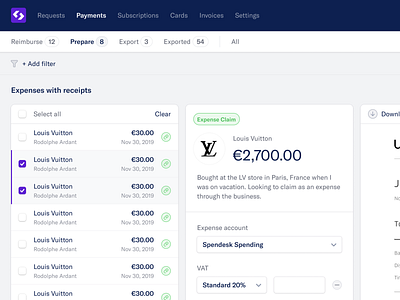
I've had the pleasure of helping out @Spendesk this week. I've been tasked with trying to come up with something new and fresh for their application UI.
It's been fun so far. I've tried my best to strip the design to its bare-minimum and completely simplify in terms of colours and contrast. At the same time, added some subtle shadows to the containers that I added.
Excited to show more of this as I work on it.
🎉
More by Spendesk View profile
Services by James
Like
