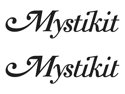
Type Logo V2 W.I.P.
I decided to get away from the script style type for this and into something more Wizard of Oz - y style. I like where this is going but I'm having trouble in a few areas. I'm working on adjusting the kerning in some areas but the biggest trouble I'm having is with the "ti." It might be because I've been staring at it but I can't stop seeing a "u." Any thoughts?
More by Sean Collins View profile
Like
