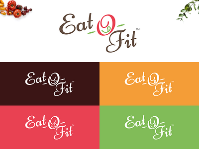
Eat-o-fit — Food and Fitness Logo
Eat-O-Fit is just not another name of healthy eating! People always feel robbed when they are asked to avoid home cooked delicious Indian food which has lots of oil, ghee and other such mouth-watering ingredients.
But Eatofit tends to explain the benefits of eating in the right manner - eat everything from your kitchen without worrying about the calories and still stay fit!
This is what the logo signifies — Eat-to-be-Fit:
1. The 'O' has a tongue - representing a delicious meal that we miss eating in the way to stay fit and dieting.
2. The letter 'f' of Fit is in the shape of a heart - representing your healthy and happy heart.
3. The colours of the logo are to depict nature, love care and trust just like we have for each other.
4. Fonts depict that there is a lot of writing coming up in future.
Eatofit by Vivksha Pahuja - https://www.instagram.com/p/Bw38-ECFByE/
