Vintage Hand Drawn Logo For Waubay Walleyes & Wings Retreat
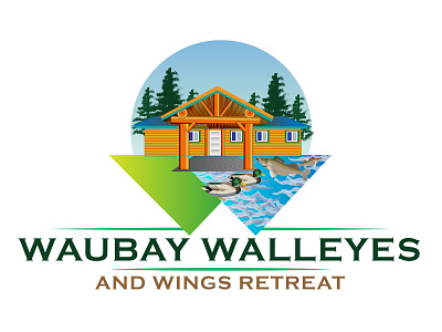
Vintage Hand Drawn Logo Made By Designrar For Waubay Walleyes And Wings Retreat. The shape of this logo is made by combining W+Location mark. W is the initial word of this brand name words. This logo has a number of additional things:
A beautiful scenery for travel attraction, a cabin, riverside, ducks, fish.
Here is the original brief from the client:
I am looking for a simple but effective logo for a rental cabin that is located on a lake. This cabin is used by families, hunters (duck/geese) and fishing. This logo will be used on social media, printed materials, and fabric (t-shirts, koozies, etc.)
The ultimate goal is to create a professional looking logo to market our rental. We want to increase revenue and target not only hunters, fisherman, but also families and friends looking for a weekend 'getaway'.
We do not have a color scheme in mind as of now. Something that is appealing to being outdoors and vacationing.