Personal Site V2 - Mobile
I gave my personal site a makeover two(2) months ago in May. It's a slight follow-through to the V1 that I released in December 2018 late last year.
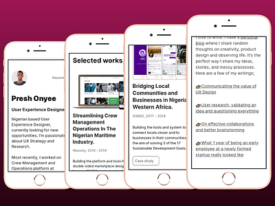
I'm happy with the direction I took for this redesign.
1. Switching my picture from being the hero image to the site logo meant I could display more relevant info above the fold.
2. Less color allowed me to draw the readers eyes to the relevant headings and content of the site.
3. I also loved the additional context to each case study, this gave a brief summary of the project so that readers could have a quick brief of what each project was about.
4. Although the layout didn't change much, the small details gave it a solid yet simple look and feel.
5. I fell out of love with Poppins and tried Inter UI 😍. Best decision so far and I absolutely love it.
I still plan for a MAJOR iteration before year end, until then pls give it a look @...https://design.preshonyee.com
