Logo WIP
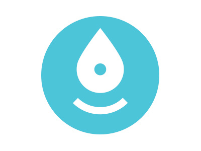
Working on a logo design for a app called 'Splash' - which aims to help you discover the local world around you, based on your interests. Would appreciate some feedback. Does this logo/icon work? Our main worry - does it skew too much from the word 'splash'? Obviously, the intent is/was for the inverted marker to be a drop, making an impact. The face is just a bonus, or is it? Thanks.
More by Rory Reiff View profile
Like
