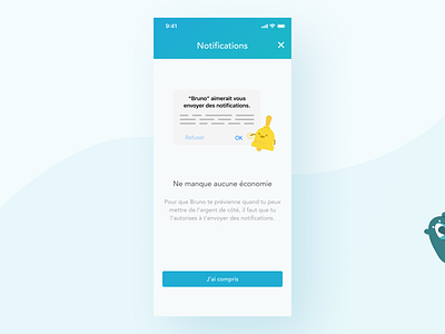
Notification incentive screen for Bruno
When UI crosses UX. Bruno's mobile app relies a lot on notifications, so I made this illustration as an incentive to accept them on your mobile device. You can only ask once 🤞
Press L if you liked it 👍
More by Raphaël Régnier View profile
Like
