Blockchain Governance Experience Redesign - Lunie.io
Another redesign proposal.
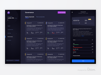
This time I’ve focused on the governance section inside the Lunie.io app.
An opportunity in terms of UX design compared with the current version is the ability to view the details of each proposal from a single view rather than going on a different page and having to click back to view the proposal list every time.
Also, my assumption is that the users attention would be more focused if we design a tab view between open proposals, that have been submitted or are in voting stage, and past proposals that either have been approved or rejected.
This way we can remove the current tab that switches between parameters and proposals and have the parameters information always available in the proposal details section on the right side of the proposal list.


