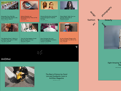
Experimental Website Design for an Online Fashion Magazine
Hello guys!
Inspired by AnOther magazine and a flower bouquet color palette (it was a really beautiful bouquet 😜), I felt like experimenting a bit that resulted in creating this fashion, design and art online magazine website.
Goals
Pushing the limits of what we are used to calling “normal” in order to expand my horizons and come up with some fresh solutions.
Approach
I focused mainly on experimenting with the layout and the solution I arrived at seems pretty standard except for the menu bar which is located in the bottom section of the hero blade. Love it. The choice of colors was purely inspirational too. The geometric font I used is called Moderat created by TIGHTYPE, and I reckoned it'd work well in this design.
Result
Check the attachment to see the full size of what I ended up with and voice your opinion. I'd say it came out pretty bold. Eager to hear your thoughts!
Press "L" to show some love!
ᗈ Join our Newsletter!
ᗈ Website
ᗈ TheGrid
ᗈ Spotify
ᗈ Twitter
ᗈ Medium
ᗈ Facebook
ᗈ Instagram


