DOT – Solving the ticket booking flow
How do you build a booking flow that is quick, easy to use, that supports the needs of both daily commuters and first timers, young and old? This was the challenge we set out to solve.
A few discoveries we made
1) The DOT zone and ticket logic is complex. There's different requirements for a ticket to be created and different rules for usage and validity.
2) Our user tests showed that users are in different mindsets when buying a ticket. These are the ones we focused on:
– I need to go to a specific location
– I need this specific ticket and number of zones
– I need a commuter card for next month
– I need the same ticket as always
3) Users are having a hard time with the zone logic that is the basis for all tickets.
4) Once the ticket is bought there’s no way to see where it is valid without looking at a zone map.
How we solved it
Our first focus was to get the very first action in the app to be logical for our users. We did almost 40 user tests on this specific part to make sure that every user, no matter their mindset, would get the first tap right. From then on we would be able to give them the simplest flow possible for that specific mindset.
Aligning the tickets
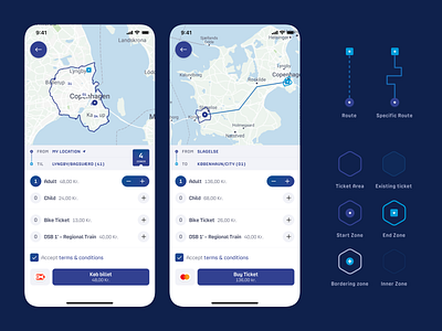
It turned out that almost all ticket types could be put into the same flow, but only if we could tweak the rules for the tickets a bit. Luckily we managed to align the ticket logic just enough to get the booking flow down to 3 steps: Choose destination, Configure ticket, Checkout.
Taking care of everyone
For users that search for a specific location (not tapping on the map) or users that needed a ticket for more than 8 zones, we would give them the option to select a route that their ticket should be based on. This helps the user to find their way, and the app to find the best ticket for that route.
Showing where your ticket is valid
The entire concept for this app was built around the map, and shows your tickets on that map. So through the entire flow, you will see your ticket being "built" on the map, as you add destinations and select routes. A lot of work went into highlighting tickets on the map, and making a custom map styling that would not interfere with the ticket markers.
Check it out in the app stores, if you're ever in Denmark
Download in App Store
Download in Play Store


