Storis CXM - Creating a responsive design system
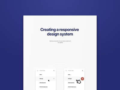


Creating a responsive design system
Given the proliferation of end-user platforms e.g. desktop, tablet and phone, it is critical that the end user solution is intuitive and easy to use across all. This demands careful consideration of each page and process. While the desktop implementation will be the most complex interpretation of the requirements with richer functionality, each level needs to afford access to the core process. You do not want to overload the end user experience because of the limitations of screen size, so sometimes on a mobile platform multiple steps maybe required for an activity that was delivered on a single page on the desktop.
You need to be creative in the way you design the mobile experience to limit the number of steps for an action. So for example on the desktop you might hover/click to initiate an action, on a mobile platform you might scroll, select and swipe.
*See attached for detailed example