Focussed on Fitness
Leanne Rive wanted to get her social media in good shape, with five fitness focussed services on the go we soon realised her many ventures needed unification under one umbrella, which all begins with a single brand.
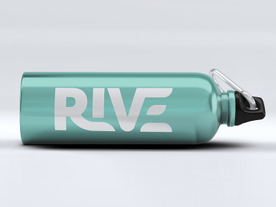
Developing a typographic approach that evokes strength and power in tangent with feminine elegance was instrumental in the roll out of collateral.
Geometric yet flowing forms nest together to achieve a distinct and unmistakable foundation from which all service areas can be attached.
The sub brands vibrant colour palette compliment both each other, Leanne's energetic personality and the fashion of fitness kit, yellow is then used as a common thread throughout social media post graphics and imagery.
Facebook covers make use of the colour palette and key information ensuring future recognition and familiarity as clientele discover new facets of the business.
A toolkit of post images allows Leanne the flexibility to boost class dates and reminders as and when space on her roster allows, simultaneously maintaining a strong visual identity while freeing up Leanne's time for her life outside of work, which happens to be training for ultra marathons.


