Logo | Lunetik 👓
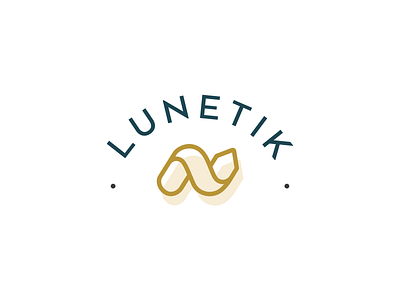

Last April, I had the pleasure to work with Alix from Studio Hörtie on the complete redesign of Lunetik, a French company that offers an eco-friendly alternative to the traditional market of optics and frames sales 👓
The specification was clear: we had to remind the concepts of recycling ♻️ and eco-gesture 🌱 while avoiding the iconography of opticians (glasses, eyes, etc).
The arrow is a key element to evoke recycling values. We chose to use that symbol by simplifying and twisting it to bring a modern, fresh and appealing look that stands out from the competition.
What do you think? Is it a successful bet?