Sea tapes

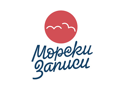
We are proud to present the logotype for @sea_tapes (Морски записи). After a lot of sketching and emailing back and forth with the client, we decided to keep the seagulls' mark and combine it with suitable lettering. What you see here is the final result.
The character of the letters is informal and based on handwriting. We used fluid forms and the appropriate ligatures to emulate a quick note. For the same reason we did not keep an absolutely uniform x-height and we interweaved slight variation in slant angles as well as in the baseline. These details bring the digital drawing closer to human writing and differentiate lettering from font.