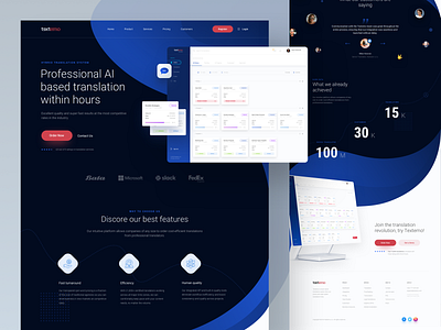
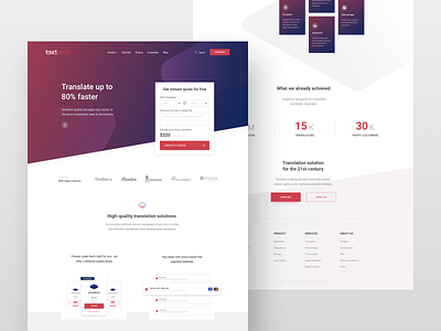
Textemo landing page
Hey guys,
today I wanna share another landing page for one of my clients and I also decided that with every shot I'll share a quick tip for starting designers as well.
Quick design tip #3: The Process
1️⃣ Always start with goal identification. Every client has different needs. For example, in this case, it's registration into the system/ordering a new translation.
2️⃣ Once you define the main goal, try to figure out the scope of the project so you can start creating user-flows.
3️⃣ Now that we have a bigger picture of the site in mind, you can start with wireframes or sketches of each page. I don't necessarily sketch every page but I'm always creating all the wireframes before I start working on the visuals. The reason is user testing. Yes, you can test the site just with the wireframe prototype (I'm using Invision for this part). You need to make sure it all works.
4️⃣ Once everything's working beautifully, you can start working the visuals. Tools like style tiles, moodboards, and element collages can help with this process.
What's your process?
🖤And don't forget to show me some love with "L" key. Thanks!
—
👨🏻💻 Make sure to follow me on other social networks as well:


