iOS 13 Dark Mode Improvements
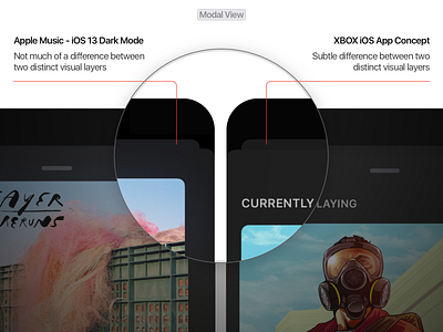
The modal view in the upcoming iOS 13 dark mode doesn't quite follow one of the primary iOS themes - Depth which says distinct visual layers and motion provide a sense of depth to users.
Here, there is no visual difference between the background and the modal. For comparison, look at the updated version of my XBOX iOS app project that I did some time ago.
Follow me for more awesome stuff - Personal Website | Twitter | Behance | GitHub
More by Anagh Sharma View profile
Like
