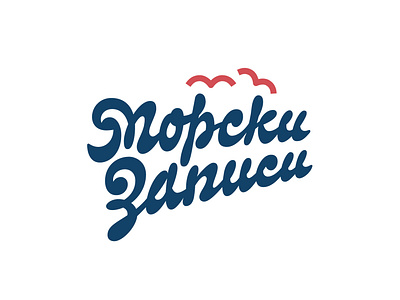
Sea tapes
The idea of our first proposal was to come up with as much ligatures as we can. This serves two purposes: (A) to achieve a handwritten feel and (B) to get shapes reminiscent of stylised sea water surface at the baseline. This is more clearly visible in the second word. Additionally, we incorporated the shape of a breaking wave into the two initials of the brand name. The overall look of the lettering is intended to give you that nostalgic time-off feels associated with the sea.
bezierclub
branding
custom
design
handmade
lettercollective
lettering
logo
logodesign
logo design
logo design branding
logo design concept
logo designer
logo designs
logotype
logotypedesign
typography
vector
View all tags
Posted on
Jul 1, 2019
More by Letter Collective View profile
Like

