Empty state
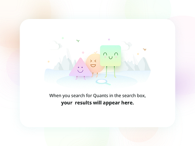
We're working on a very interesting in-house product. I will reveal more details about the product closer to its launch date. But for now, sharing one of the empty state illustrations I made for the product.
I made this illustration to guide users to use the search toolbar to find details of an employee within the organization. Guiding users to the right input field without making them feel confused about the functionality is one of the most basic things that you can do for your users. Here's my attempt.
More by Quovantis View profile
Like

