Logo Design for Freebird Capital
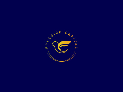
As the logo must have a solid thought process behind, the above logo is built on a concept based on the client brief. The initials of Freedom Capital are incorporated with bird silhouette that is leaving the nest symbolizing freedom since Freedom Capital gives freedom of fulfilling dreams to old age people. The round shape of logo is taken from a money coin which is majorly involved in the lending business. Logo could be easily used as single-tone or even with gradient colour theme. A minimal and clean look is tried to achieve in order to make it look sophisticated and modern.