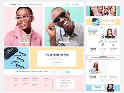
Warby Parker Redesign
Had a lot of fun brightening up Warby Parker's website! When I got the original class assignment I thought the website had too much of a serious tone at the time. I was really inspired by some of their previous photos where the models were cheerful and had bright backdrops!
More by Chrissy Pisarczyk View profile
Like
