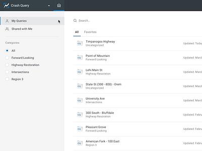
App Navigation
Over the last several days I've been polishing the CSS of our new navigation with our dev team. I love fine tuning the timing and transitions to make it feel just right. It's the little things, ya know?
This is actually the tail end of a global rehaul of our navigation structure. The previous layout and organization just weren't flexible enough to account for all the different clients and integrations we have. This new design uses space much more efficiently, consolidates multiple menus into one place, and sets a style standard we're going to be moving everything more towards. It should stand the test of time :), and it responds to different screen sizes, which is also an improvement.
Excited to see it make its way into the hands of our customers.

