Not Impossible Awards
the client:
Not Impossible Labs is an award-winning technology incubator and content studio whose mission is to change the world through technology and story. On June 1st, the second edition of the Not Impossible Awards honored the people who are making strides in this purpose-driven technological movement. The celebration included various forms of inspiring entertainment, as well as the premieres of several of the films that documented the winners’ journeys. We proudly partnered with Not Impossible to redesign and elevate the event’s branding, visually translating their beautiful mission into a bold and disruptive design system.
the challenge:
We wanted to channel Not Impossible’s brand and values into something that felt new and attractive while remaining informative and direct. Everything that we designed had to portray the brand’s highly technological background as well as their humanitarian goals. Many of the items we designed, including the award show’s logo, were a big part of the company’s already established identity, so we had to find a way to make the visualization of their personality immediately perceivable and yet still pertinent in years to come.
the solution:
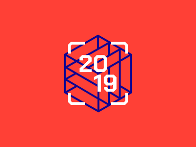
One of the first things we did was give the brand’s signature “impossible cube” a refreshing new twist. Everything from the typography, to the photo filters, the color schemes, and the overall layouts, was made to portray a balance between the company’s technological nature and its very personal and human focus. By using a very bold, pop approach, we also managed to make items that stood out and called attention to the brand’s important mission.
graphic designer: @bruno moncada
