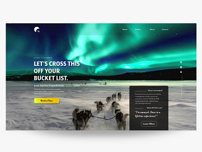
UI Practice-1 --- Northern Lights Tour Landing Page
This is a landing page I've created just to practice UI design. I used modular scale, and the golden ratio between design elements such as body&display text size, social icons size, column width, etc. I think this is a good way to practice design principles such as alignment, contrast, balance, and proximity.
I also paid special attention to the CTA button's shape, size and color. I've learned that rounded corners point inward and draw the attention to the content of the button, whereas a square edge points outward and draws the attention away from its object.
I’d be very happy if I get any feedback, suggestions and/or tips. Any piece of knowledge on how I can improve myself is deeply appreciated :)
Photo Credit: Thomas Lipke
https://unsplash.com/photos/oIuDXlOJSiE
