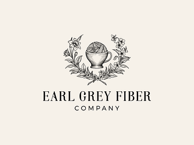
Earl Grey Fiber Company - Logo upgrade
The project was to revamp of an existing logo. The client wanted to fill out the logo and to surround the tea cup with fuller foliage. The font has been changed by more elegant sans serif that makes the logo look mature and classic.
More by Yokaona View profile
Like


