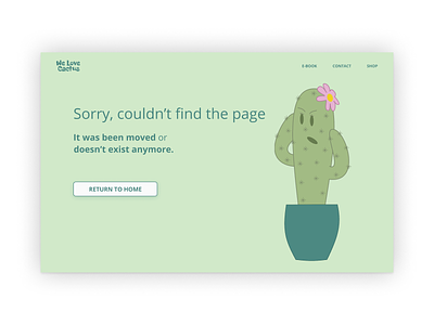
Daily UI | Challenge #8 | 404 Page
404 page, this was fun!
First a take some time to understand de good practices in 404 error page.
So is important to show clearly what is going on, and guide the user to some page that is useful.
The concept was a page of an online shop that sales cactus! And the error page has a picture of a shock cactus trying to understand what is happening.
I use the colors of cactus to drive this project, I really have a hard time with fonts and colors, looking to the end result I can see a lot of stuff that needs improvement and that I could change... But I'm here to learn with these mistakes... Maybe in the future, a made a redesign of all these projects.... :)
More by Martin Patz View profile
Like
