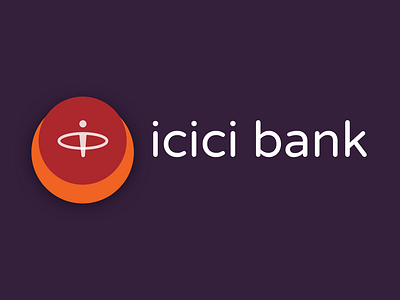
ICICI Bank Rebrand
How do you rebrand something while maintaining the familiarity and simplicity?
In this project I envision how rebranding of ICICI Bank, the second largest bank in India would be imagined. Great banks are known for their trust, stability and customer focus. The ICICI brand is one of most distinguished and recognizable brands in India.
The challenge involved striking a fine balance between redesigning and retaining the connection with the brand.
-Visual representation of the customer in front and center of the logo - in line with the brand goals.
-The logo and wordmark now exhibit visual balance by removal of slanted elements.
-The color palette, however retain the trusted, familiar hue.
-The typeface has been refined and now features a fresh and open source font : "Varela Round".
Full rebrand work here: https://www.behance.net/gallery/82125659/ICICI-Bank-Rebrand-Concept
