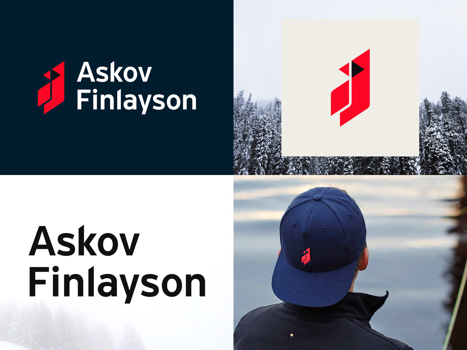
Askov Finlayson Rebrand
A look at some of the new brand work that just launched for Askov Finlayson in Minneapolis.
The new mark features the Northern Cardinal because it's one of a few birds that doesn't fly south for the winter. We wanted to do something that felt abstract but still recognizable as a cardinal.
Also includes an updated wordmark where we adjusted things for better spacing and production with fabrics and stitching. Still kept some of the distict qualities of the previous wordmark that were in keeping with their tradition of using type inspired by that found in highway signage. The cuts of the stems in the “k” and “l” have been adjusted to match the angles used in the cardinal.
A few other cool details I won't go into here... but super happy with how it turned out. All part of a larger rebrand that we’ll be rolling out more later this year! 👍
