Ecommerce Website on Mobile
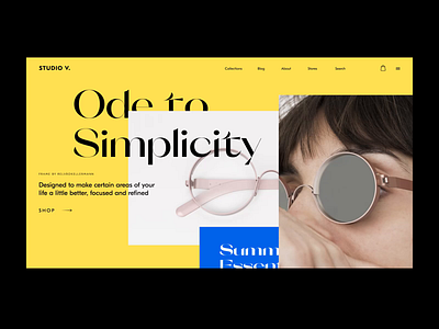
As it was promised, today we give another look at design for an ecommerce website from our previous shot, an online store selling exclusive clothes and accessories united with a philosophy of minimalism. It continues the ode to simplicity but at a mobile perspective: here's how the layout of the hero section will transform on mobile screens. Contrast color palette is combined with the contrast of fonts to catch users' eye and add a pinch of style and elegance to text content. Catch the vibe!
More by tubik View profile
Services by tubik
Like

