Try keeping colors to two #Designtips
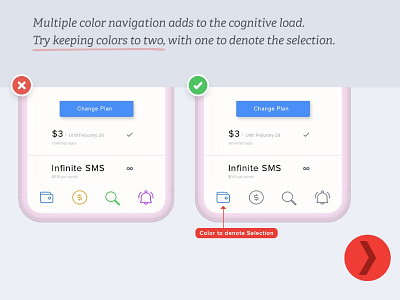
Multiple color navigation adds to the cognitive load. Try keeping colors to two, with one denote the selection.
Multiple color navigation adds to the cognitive load. Try keeping colors to two, with one denote the selection.
