Website Redesign for a Market Research Platform
Hey guys!
Here at Zajno we’ve recently made a few designs for Native, a market research and data collection platform. The company’s goal is to change the way market research is tasked, collected and delivered on demand. The platform allows businesses task locals anywhere in the world to collect data on their shops, hotels - you name it, in order to be able to monitor the quality of the goods and services they sell.
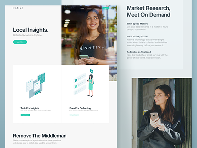
First, the guys from Native reached out asking us to create several illustrations for their website and @Sofy Dubinska took care of it. Later on we were also asked to redesign a few pages of the company’s current website. What you see above is one of these pages, check the attachment for the full size.
Join our Newsletter for more news!
Goals Creating some fresh and informative designs that would incorporate the new illustrations and blend in with the rest of the website.
Approach We used the company’s brand colors and stuck to the minimalist approach in design paying great attention to smart whitespace utilization. The only twist in the overall design is unconventional layout and the use of broken grid that make the website look a bit more eye-catching.
Result We ended up with a clean and intuitive design, check it out here and let me know what you think of it!
Press "L" to show some love!
ᗈ Join our Newsletter! ᗈ Website ᗈ TheGrid ᗈ Spotify ᗈ Twitter ᗈ Medium ᗈ Facebook ᗈ Instagram

