Music.com - LO/FI Wireframes

Hi Dribbblers,
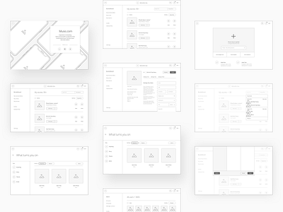
Before We started our work, like moodboards, branding, and design part. We had to focus on the most important part. Wireframes, low fidelity wireframes.
Those wireframes were created for our first scope, MVP part.
You can check theme here: https://www.figma.com/file/ThDk97tky8XfUJVHBAwdoyTg/Music.com---Lo-Fi-copy?node-id=0%3A9505
4 pages, with wireframes:
1. First approach for uploading a story (single or multiple)
2. Itreation for the upload, plus we started working on some basic pages.
3. "Changes"
4. Curator dashboard, admin panel, login, register, landing page, home page and more.
Enjoy
For the last 9 months, we've been working on a complex project Music.com. Its purpose is to tell stories behind songs. In the next couple of days, we'll share what we've done and what we wanted to achieve with this project.
What is Music.com? 🤔
We know that if sounds get our attention, the stories hold it; if the songs create fans, the stories create super fans. We believe song stories come in all shapes and sizes and, most importantly, belong in the same place – connected by their genre - and decade-spanning similarities.
How did we help? 🙌
We created a new information architecture with UX improvements, mood boards (look& feel), UI design and branding.
🗒️ Annotation
Done in close collaboration with our friends over at VentureDevs who was responsible for the development process.
