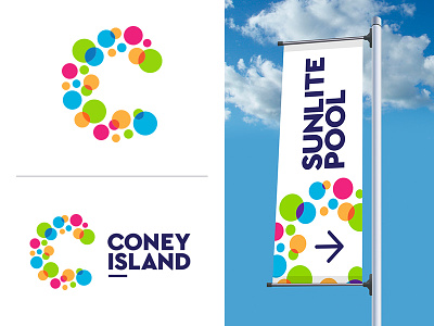
Coney Island Logo
Coney Island (not the one in New York... the Cincinnati, Ohio one) was rebranding. This was a rejected concept. The park is a large pool and water rides, small amusement park rides and community park-like atmosphere. The park wanted an identity that showed a "variety of diverse experiences" and a "spirit of play." This logo could have extended across the park as an identity. The idea was also to underline the word "is" in the logo. This is an abbreviation of "island" and was going to extend to a "Coney Is ______________" brand launch campaign.
More by Andy Sharpe View profile
Like
