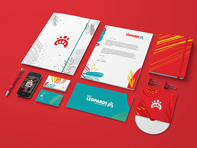
Youthful Paw-ceptions
We recently rebranded Jersey College for Girl's After School Club - Little Leopards.
When rebranding an After School Club there are two things to bear in mind:
1. Make sure the logo is of a higher standard than what the pupils attending could make.
2. This is not a brief to visually overcomplicate.
Starting with the logo, we wanted a simple marque with immediate recognition. The visual was twofold in meaning; a paw print within a paw print is a direct reflection of the name - Little Leopards. It also references the role of the older schoolchildren in leading the after school club - this can be seen as silhouettes of the older kids, with the young'uns reversed out beneath. A rounded typeface matched with a script font unites each element to form the brand.
Now the next stage, could be populating all roll-out collateral with stock images of happy, smiley children. After all, this is an after school club right?
We took a different route - using jungle themed illustrations, patterns and textures to form a library of visuals. Finding the balance between messy overkill, and considerately crafted compositions can be difficult. We hope you agree that we managed to walk that fine line.


