HYPESCHOOL media, design & more


client
A supplementary school in Germany aimed at helping children and teenagers develop competencies and practical skills in the field of multimedia and graphic design.
issue
The client had named the brand HYPE to capitalise on the meaning of the word in the German language - heightened interest in something. Our task was to create the school’s visual identity that would convey its core values: the joy of learning new skills, freedom of creativity and self-expression in the digital space, and contemporary and dynamic spirit.
solution
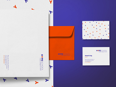
We adopted a minimalist approach to design and developed clean and neat logo using an elegant mix of extra bold and extra light versions of the same sans serif font. Through combining two bright colours, blue-violet and orange, we gave the brand a bold appearance to reflect its creativity and energy.
We used “Y” as the leading graphic element of the visual identity. The highlighted Y in HYPE conveys a child with arms outstretched towards learning new things and embracing the world. We introduced a pattern of scattered “Y” letters in the key brand colours to further accentuate the dynamism and creativity of the brand.