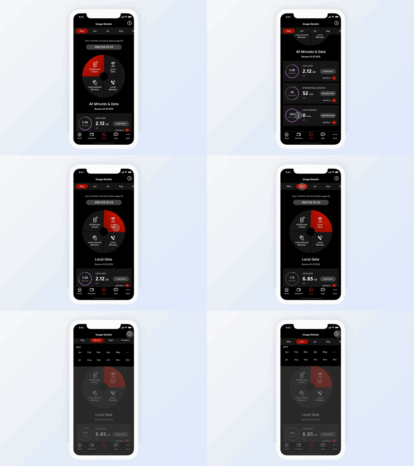
Data Usage Dashboard
For this shot idea, I was exploring how to reduce the number of navigational steps and present all data on the same screen, so the user doesn't move back and forth.
Some suggestions on the visual hierarchy of a data displayed were made as well.
The red color was experimentally used as a primary color rather than for error states.
More by Max Palyvoda View profile
Like
