SolaJet Pt. 2
Pt. 2 of the SolaJet project that I am working on.
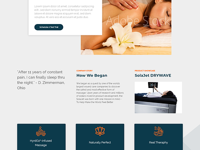
Went with the tone of orange and blue to compliment each other on a light grey background for the website. Wanted to add spacing through the website so that it can be seen as a calm tone instead of a clutter due to being a business that strives on bringing relaxation to their product users.
More by Brian D. Whiting View profile
Like
