MEVS

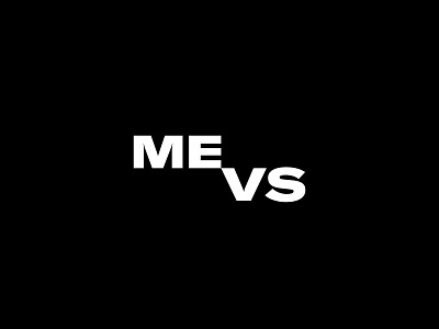


n this case “versus” becomes the powerful antipode which embodies the message visually with a help of diagonal approach.
It is simple, yet iconic design centred around sharp lines and monumental typography. The result is bold enough to make a statement, but flexible enough to appear alongside a wide range of new experiences. Whether it’s an actual to do list or a system that helps distribute and present various categories in a clear manner. Together with a tagline, logo empowers and welcomes anyone who wants to build healthy habits.