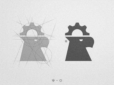
PFVA - Logo Design
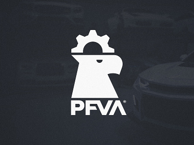

The true beauty of this particular mark comes when it is paired with the type. The alignment and spacing between the different parts of the logo create the perfect balance in my opinion, just as the different parts of a car need to be perfectly put together 🚗 I went with a very dark blue along with white for the palette because i see a high association between those colors and high end cars. Do you think it was a good choice? ⚙ Have a good week!