RaGroup
Want to boost your business with a memorable design?
Get it with 15% OFF via promo code «dribbble»⬇
logomachine.net
logo@logomachine.net
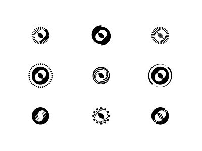
Our client RA Group is a large industrial holding. It is necessary for them to have a corporate style that will visually unite all areas of business that RaGroup sub companies are involved in.
The sign is transformed into different directions but remains recognizable. It is easy to use it for printing: the composition is concise and balanced, looks great on any medium.
The basis of identity is simple- black and white. There are shades that you can place accents — "Sunny" yellow and blue. Minimalistic typography makes the style solid. The new design is easy to use, easily combines all areas of business and makes the right impression.

