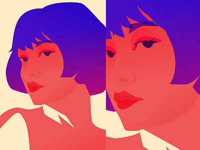
Clumsy Colors
I just experimenting with a new color scheme and I kinda love. Talking about a piece, I just made a portrait and my mind just went blank, because it looks okay, but you have this strange feeling that something is missing and that drives me crazy. I tried a lot of times to make finishing touches that would bind all the details together, but I always come back to this image. I also though is it okay for artist/designer post work he is not comfortable with and my answer is YES, because the most valuable thing for me is to see the other people process and I learn from it a lot, also no matter how small or bad the piece turned out you should always take pride in it, because it is you who created it (and take critique in the same manner). Tell me in the comments what you think, maybe you know a brilliant way how I can improve this piece.
