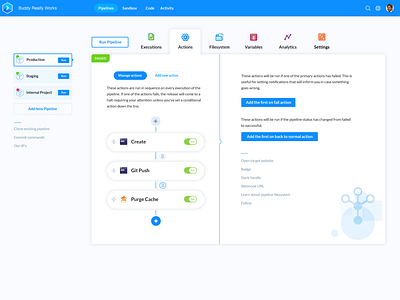
Buddy Playoffs: Manage Actions/Pipelines
Our team uses Buddy deployment extensively and the UI is pretty sweet already. The only improvement(s) I can see is for updating User Experience: avoiding going back and forth between your pipelines and actions. Instead of constantly going to the top to go back to a different Pipeline, there needs to be a easier way to navigate between.
Hence, my concept utilizes hierarchy and more obvious location for the user on a page by taking advantage of the side navigation and tabs to switch back and forth instead of vertically navigating.
To add an Action, User needs to stay on the same page so he can switch between existing Actions easier.
My opinion is Buddy has a pretty distinct and strong design style and instead of rethinking and making it look 'designy', I focused on figuring out the more friendly experience for someone who uses Buddy pipeline every day with my dev team.
Also, in my design the user photo is of Brad Pitt, I mean, come on.. Can't go wrong with that.

