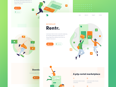
Rentr - Landing Page Illustration
Everybody in the futuristic 2019 can remember back in late 2017 when large image and auto-play videos where the hero image of choice.
Now, your window into the future! Is it a good trend? I generally think it is more human than a stripe-like style which, to me, is more product-centric & focused on features instead of values. This new trend helps build a connection with the user, creates certain feelings, and just feel more friendly and fun.
So whats style is it ?? If you see airtable, Intercom, and slack site, you will know illustration is the answer.
Well, this is a landing page i do with research about three point, include style, illustration, and color. Every single scene i design to built a connection with the user, so user can understand eassily, and every CTA button can function properly.
I design an animated landing page for one of innovative startup that called "rentr.me", A p2p rental marketplace. An illustration, color, layout, typography, and iconography i research to built "that" connection.
see my instagram to see animation 🔥!
-------------------------------------------------
Interested to work together? Shoot your business inquiry to rifaldi20006@gmail.com
Also check my another shoot and lets sharing on my instagram https://www.instagram.com/faldi26
