Pricing Elements
I decided to use dribbble as a platform to share more about interface design bits.
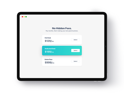
The goal of this design is to make the "Dedicated Desk" being chosen over the others by users. That's why I make the card design different by adding gradient colors.
My hypothesis is the user will be attracted to check it because of the different colors. It mimicking some sense of "Discounted" or "Best Deals"
More by Dimas Wibowo View profile
Like
