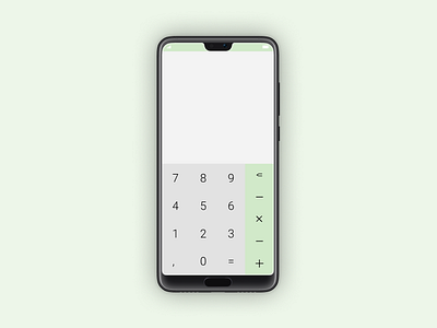
Daily UI | Challenge #4 | Calculator
I focus my energy on the understanding of the best way to present the buttons to make a calc, to be honest, we have nothing to change of the pattern existent. lol
I create a grid to fit symmetrical all the buttons, the color green present in the operational button and the notch, is inspired in finances and money.
More by Martin Patz View profile
Like
