Buddy Playoff: Automate the Web Development
@Buddy
I think is all about simplicity and usability
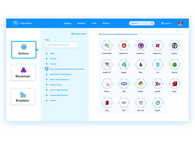
Before starting the design of The user interface I make some search in User experience And I found a small problem in the website :
- the top bar : in the previous design I discovered the search icon is not much visible
" It is not recommended to hide search inputs behind a button or Icon click. This leads to reduced visibility of the search element, and increased interaction cost in the form of an extra click. "
source : https://uxdesign.cc/best-ux-practices-for-search-inputs-c44dba565448
" I don't know is that important problem or not but I make some effort "
For the actions I create a list of the action categories
the user no need to make a big effort to scroll the display and find the action , just tap the action name in the ( filter bar ) or navigate between categories of actions (check the prototype video in this shot or you can watch it in this link https://vimeo.com/343817131 )
Hope that's helpful, if you have any idea or advice you welcome :)
Press L or F for like this shot


